Creating Harmonious Workspaces Using Color Psychology
Color does more than fill a space with personality. It affects how people feel, behave, and interact inside that space. Whether it’s a quiet corner in a luxury hotel or a vibrant open lounge in a co-working space, the right colors impact mood and energy levels. Hospitality environments rely heavily on people experiencing comfort, warmth, and ease. And color is a silent force driving how those feelings come to life.
In places designed to welcome, soothe, or energize guests such as hotels, cafes, retreats, or clubs the emotional impact of color choices isn’t just helpful, it’s strategic. Rooms painted in calming tones encourage guests to unwind. Lounges brushed with stimulating hues quietly energize social interaction. When planned with care, color psychology makes a space feel natural, balanced, and intuitive. In Gurugram’s fast-paced setting, this intentional approach to color can create a sense of stillness or inspiration, depending on the type of experience the space seeks to offer.
Understanding Color Psychology in Workspaces
Color psychology is the study of how color influences human behavior, and it plays a significant role in interior design. Each hue taps into certain psychological triggers. Some shades can boost concentration, inspire collaboration, or spark creativity. Others cause fatigue, anxiety, or restlessness if overused or poorly matched.
Workspaces across corporate, retail, hospitality, and even home settings can benefit from color psychology. In hospitality design, where ambiance directly affects guest satisfaction, this makes color choices even more meaningful. A well-designed hotel lobby or a thoughtfully designed spa in Gurugram thrives on visual comfort and emotional balance. Designers often rely on color to control how someone feels the moment they step in safe, productive, energized, or calm.
Color doesn’t act alone, though. Its effects are influenced by where it appears, how much of it is used, and how lighting interacts with it. For example, a soft green wall in a hotel room paired with warm ambient lighting creates an entirely different mood than the same green shown under direct white overhead lights. Knowing how to apply these principles with clarity helps create spaces that are not only visually appealing but also emotionally aligned with the function of the space.
The Impact of Specific Colors
Different colors serve different psychological functions. They can either ground a space or energize it. Picking the right shade means more than choosing what looks pretty. It’s about matching emotional intent with the purpose of the room.
Here’s how some commonly used colors perform in hospitality spaces:
– Blue: Often linked to focus, peace, and reliability. Perfect for quiet lounges or wellness areas where the idea is to slow the pace. It’s especially useful in spas or meditation rooms.
– Green: Gives off a tranquil and refreshing vibe. Great for areas that want to suggest calm, like reading corners or retreat rooms. It connects easily with nature, which makes people feel more relaxed.
– Yellow: Bright, cheerful, and engaging. It works well in cafés, creative studios, or play areas inside larger hospitality spaces. Using bold yellows in large doses can be overwhelming, so placement matters.
– Red: Carries energy and excitement. A few red accents can spark conversation in common areas like open dining sections or game lounges. Too much red may cause restlessness, so use it with control.
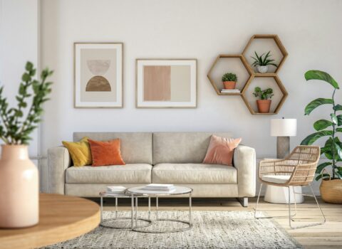
– Neutral tones like beige, cream, and taupe create a timeless and muted base. These tones add a sense of balance and let the eye rest. Because of their versatility, they’re often used to direct attention to textures, lighting, or focal decor.
A good example of thoughtful color use might be a mid-size boutique hotel in Gurugram that uses soft olive green and oatmeal tones in guest rooms to encourage relaxation at night, then shifts to washed yellow and white in communal morning breakfast areas to gently energize. These shifts cue the body to move from rest to action without it being obvious.
Every color tells its own story. The key lies in arranging those stories carefully across the space, aligning emotional response with natural human behavior. That balance is where true harmony starts.
Practical Application in Hospitality Design
Understanding color psychology is helpful, but applying it successfully is what completes the experience. Hospitality design in Gurugram is evolving fast, with growing demand for spaces that feel intentional and carry emotional function. Color plays a lead role here, not in isolation, but as part of the way each zone connects with people.
Start with the lobby. It’s the first space guests see, so its tone should be welcoming and grounded. Earthy neutrals with natural greens can help create a calm, grounded first impression. Pair these with textured surfaces like linen panels or stone finishes to layer character without visual noise.
In lounges, where movement and casual interaction naturally happen, yellows and soft oranges can add lightness and warmth. These spaces benefit from accents cushions, artwork, or lighting fixtures rather than full-surface applications. Guest rooms work best with subdued tones. Muted blues, soft mauves, sage greens, or layered off-whites let the eyes rest. Here, color can be woven through bedding materials, wall finishes, and warm-tone lamps that cast relaxing shadows.
Dining areas need a mix of energy and comfort. Food spaces should feel inviting yet bright enough to function. A blend of wood tones, earthy reds, and soft golds often works well. Using light with adjustable color temperature lets the experience shift from breakfast buzz to evening calm without repainting anything.
To implement this seamlessly, consider:
– Wall finishes: Paint, textured wallpaper, or limewash for softness or depth
– Upholstery: Chairs, beds, sofa accents in mood-setting tones
– Lighting: Layer color through lighting fixtures, filters, or smart bulbs
– Decor accessories: Art, rugs, vases, or table settings in complementing colors
– Flooring: Area rugs or inlays that reflect the primary palette subtly
Every area has its own purpose, so color should meet that need. Think of it less like branding and more like creating moods that align to how a space is meant to feel and function.
Blending Color with Texture and Natural Principles
Even the best colors fall flat when divorced from other elements. Texture, material, and light all pull focus and affect how color behaves in real life. In hospitality design across Gurugram, where natural light fluctuates and guest expectations vary, this interplay becomes central to forming restful, luxurious spaces.
Smooth walls, glossy floors, raw stone, and soft upholstery each respond to color differently. Glossy finishes intensify the shade, while matte surfaces mute it. Adding texture through wood, natural fabrics, or raw metal softens the look and makes spaces feel inviting rather than clinical.
Along with material variation, lighting defines how a color appears. A neutral beige under warm lighting appears cozy. That same paint under cold lighting skews gray. Always pair color plans with the lighting plan, especially for hotels or boutique retail where mood control is important.
Vaastu offers deeper purpose by aligning spaces with natural order. In hospitality environments, it can direct color use in meaningful ways. Certain directions may favor cool tones, while others invite warmth. Vaastu doesn’t just inform layout. It also gives cues for color distribution that support space-specific intention.
Green design principles make the palette feel grounded. Natural, chemical-free finishes. Organic fabrics. Recycled materials. All of these let the color reflect nature rather than fight against it. A plant-filled lounge with walls in olive or dusty bronze doesn’t just look sophisticated. It feels like it breathes.
To truly elevate a space, use all five senses. The color may set the emotional undertone visually, but texture connects through touch. Material warmth plays through sound. Lighting adjusts tempo. Even subtle scents matter. Color’s role sits within that system, never solo.
Designing with Intention for Deep Comfort
Great hospitality spaces in Gurugram do more than look sharp. They resonate emotionally. When color is used with psychological intent and paired with thoughtful design choices, the result is a space that naturally invites rest, connection, and clarity.
People often remember how a space made them feel. A hotel room that eases the mind after a long day. A café that invites conversations without feeling too loud. A lounge that couldn’t be described, but somehow just felt right. The groundwork for these moments often starts with color.
Choosing the right palette isn’t about following trends. It’s about understanding how people naturally behave, feel, and interact in certain surroundings. Then matching colors, materials, and layouts that support that behavior across the entire experience, not just in single moments.
The best type of hospitality design supports lifestyles without forcing emotion. It flows. And it’s through this lens that color, combined with design psychology and natural balance, moves from being something decorative to something deeply functional. When spaces speak to the senses, guests don’t just move through them. They connect to them. That’s what creates comfort. That’s what leaves a lasting impression.
To explore how Resaiki can bring the magic of hospitality design in Gurugram to your next project, take a look at our extensive portfolio of past work. Discover how our thoughtfully designed spaces blend warmth, purpose, and sensory balance to enhance every step of the experience.