European Color Palettes That Transform Indian Living Spaces
Color has the ability to completely shift how a room feels. Whether you want to add energy, calm the vibe, or bring in a sense of harmony, your color palette plays a big role. When it comes to Indian homes, there’s already a strong foundation of texture, tradition, and personality. But mixing that with European color strategies can introduce a more layered, elevated style. It’s not about stripping out the heritage or cluttering the space with trends. It’s about choosing the right tones that amplify what’s already working.
European interior decorating often balances subtlety with sophistication, giving homes a look that’s clean yet personal. That kind of approach works beautifully in Indian settings when done mindfully. Light neutrals, soft pastels, natural finishes, or deep contrasting hues can create dimension without overpowering the space. Beyond aesthetics, the focus is on how the colors make you feel, how they respond to light, and how they evolve with the home over time.
Classic Neutral Tones
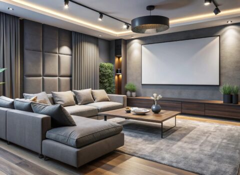
Neutral colors are often the backbone of European interiors. Think rich whites, charcoal grays, warm taupes, and soft beige. These shades offer clarity, calm, and an understated kind of luxury that doesn’t need to shout. In Indian homes, where textures and patterns are already strong, bringing in neutral tones can help balance the mix and give the eyes room to rest.
A neutral base supports everything around it. That means your wooden jharokha frame, brass hardware, or colorful cushions won’t compete for attention—they’ll actually stand out more. These tones reflect varying lighting conditions well, which is useful in Indian environments where lighting changes throughout the day. Use them on main walls, floors, cabinets, or large furniture pieces to create a solid foundation you can build on.
Here are a few practical ways to use European neutral tones around your home:
1. Pair chalky white walls with espresso-toned wood accents for a soft contrast.
2. Use putty or stone shades as a background for colorful handmade rugs or pillows.
3. Opt for matte neutral upholstery to tone down areas with heavy detailing.
4. Try greige or soft taupe cabinetry in the kitchen for warmth without heaviness.
Look for neutrals with depth instead of flat, one-note shades. Undertones can shift how a space feels. A beige with a pink or gray base may lean warm or cool depending on natural and artificial lighting. That slight variation adds subtle interest and personality.
Bold and Vibrant Hues
On the other end of the spectrum, European decorating doesn’t shy away from strong color. Deep teals, burgundies, mustard yellows, and forest greens often appear in textiles, accent walls, or standout furniture pieces. These colors aren’t just thrown in randomly. They’re usually balanced with clean finishes and neutral surroundings, so their presence feels intentional and well-placed.
Bold colors already have a home in Indian interiors. The difference lies in moderation and composition. Rather than overwhelm the space with too many saturated tones, focus on how and where a bold hue is placed. An accent wall, a single piece of furniture, or carefully chosen decor items are often enough to shift the vibe of the room without visual fatigue.
Try these approaches:
1. Add a deep olive or navy wall to highlight a reading nook with neutral furniture.
2. Use mustard or burgundy throw pillows to add spark to an off-white sofa.
3. Frame bright artwork in clean-lined black or metallic frames to tone it down.
4. Try emerald or cobalt tiles behind a kitchen counter for a rich backdrop.
When bold color is used this way, it becomes a feature, not a distraction. The colors help create energy in a room and speak to mood and movement without overpowering everything else in the space.
Earthy and Natural Shades
Earth-based tones like warm browns, olives, rust, ochre, and clay hues are very much a part of European interior design. These palettes have a raw honesty that works in spaces needing calm and cohesion. Materials like matte stone, brushed metal, raw wood, and terracotta often carry these tones into form.
Indian homes naturally welcome these shades through stone flooring, woodwork, and woven elements. Instead of fighting against those details, earthy tones can help those materials feel more integrated and intentional. The simplicity of these shades helps a room settle and gives the eye gentle transitions from one space to another.
Consider earthy shades in these ways:
1. Use sandy beige walls as a soft base for cane chairs and hand-formed pottery.
2. Go for rust, amber, or clay textiles on jute or coir rugs for a layered look.
3. Paint a hallway or entry with a brown or walnut tone to create a cozy entry.
4. Install dusty green or mustard-hued shelving units or sideboards to bring visual warmth.
You may also consider transforming outdoor spaces with these tones. A muted olive balcony wall and unfinished teak furniture with soft cushions can turn even compact areas into relaxed nooks without doing much else. These shades offer emotional comfort, which adds another layer to the way the design touches human experience.
Pastels and Soft Palettes
When you’re looking to calm a space or make a small area feel bigger, pastels play a special role. These aren’t overly sweet or juvenile colors. European pastels tend to be more dusty and toned down—soft sage greens, powder blues, muted lavenders, and faded peach hues.
Soft color doesn’t have to mean bland. These palettes can act as the bridge between detailed Indian architecture and a desire for airiness. Use these hues to lighten up archways, alcoves, or cabinetry without stealing focus from handcrafted wood elements or bold floor patterns.
Pastels work especially well in:
1. Bedrooms that benefit from relaxation and softness.
2. Kids’ rooms that need brightness without overstimulation.
3. Bathrooms with neutral fixtures enhanced by colored walls or textiles.
4. Light-starved stairwells where subtle color can add mood without heaviness.
Textiles and decor are great entryways into using pastels. A soft lavender headboard, a sea-mist kitchen cabinet, or a pale yellow hallway runner can do more than add interest—they support emotional intention. Pastels should feel like pauses in your space, not the entire statement.
Infusing European Elegance into Indian Homes
Combining the two design philosophies doesn’t mean compromise. Instead, it’s about finding resonance—what works well together and where subtle blends elevate the entire space. A sage green from a Scandinavian palette, paired with Indian wood furniture and brass lighting, can feel grounded but elevated. Mix sleek European lines with Indian colors and traditions to get a refreshed but familiar feel.
Balance is key. If your base is rich—carved detailing, mosaic tile, or bold textiles—use neutrals and pastels for contrast. If your home is more minimal in its build, bold hues and texture can add much-needed depth. Each room has its own personality, so let the balance shift naturally based on use, light, and energy.
The best outcomes happen when you stop trying to fit into a single design script. Use mood, story, materials, and color to tell your own version of beauty. A home with identity, purpose, and character builds emotional value, not just aesthetic one.
Embrace European Elegance with Resaiki
Adding European color elements to Indian living spaces allows for warmth, calm, and intention. It’s not about making rooms look like they belong in another country. It’s about using color to shape energy, honor culture, and reflect who you are.
With thoughtful curation and a focus on how spaces feel, European interior decorating works as a supporting frame for the rich textures already found in Indian homes. Neutrals give rest, bolds create excitement, earthy tones root the space, and pastels offer softness.
Let your color choices carry emotional clarity and aesthetic balance. Once the tone is set, the rest of your design will begin to fall into place.
Whether you’re inspired to transform your living room or rejuvenate your entire home, european interior decorating offers a thoughtful blend of elegance and comfort. Explore how Resaiki brings this aesthetic to life through curated spaces that honor your personal style while speaking to all five senses.